In 2025, more people are stepping away from plain white walls and soft greys. Instead, they’re choosing colors that portray who they are, not just what’s considered “safe.” A fresh coat of paint in the living room or a new color on the outside, with the help of an exterior painting company, can completely change how your space looks. Colors like earthy tones and bold pastels are taking the lead in 2025. It’s less about trends and more about choosing shades that feel honest, personal, and timeless. If you’re working with or as a painting company, understanding these shifts helps turn a house into a home that feels alive.
Why 2025 is the Year of Color Confidence
This year, color isn’t about playing it safe but about feeling something. After years of beige, greige, and sterile interiors, homeowners are leaning into colors that say more. Designers across the board are noting a rise in expressive, mood-driven palettes. Even paint manufacturers are reflecting this trend with more daring color-of-the-year selections. Colors like deep charcoal and cool cosmic blue show the move toward intensity and depth. For a painting company, this means your clients may not know exactly what color they want, but they know how they want the room to feel. That’s where your role gets more creative: guiding them not by rules but by intention.
Interior Painting Trends
Soft greens, bold pastels, and other rich tones are bringing more personality into indoor spaces. This section looks at the top paint trends and how they’re changing the feel of different rooms.
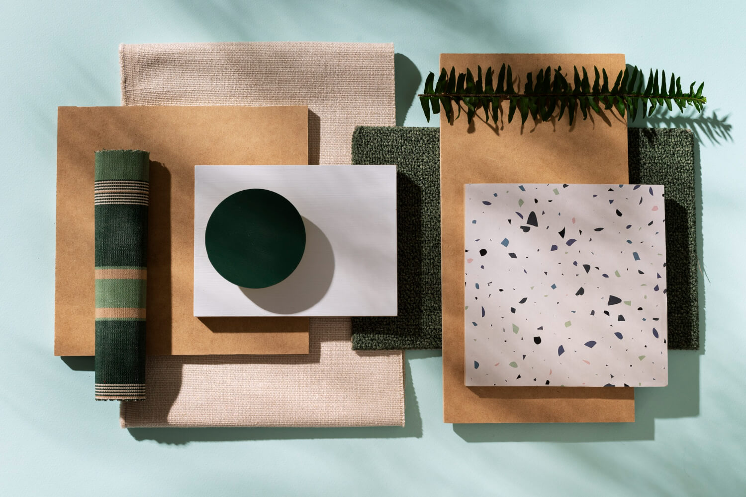
Earthy Tones
Earth-toned colors like terracotta, olive green, sienna, and muted clay bring a sense of warmth and calm, which helps rooms feel more natural and lived-in. These shades work well in living rooms, bedrooms, and kitchens. A clay-red dining room feels grounded and elegant. An olive green bedroom adds a quiet, cozy touch. They also look great with materials like wood, jute, and linen, fitting both modern and classic homes. Earth tones also hold up well over time, so they’re less likely to go out of style.
Bold Pastels
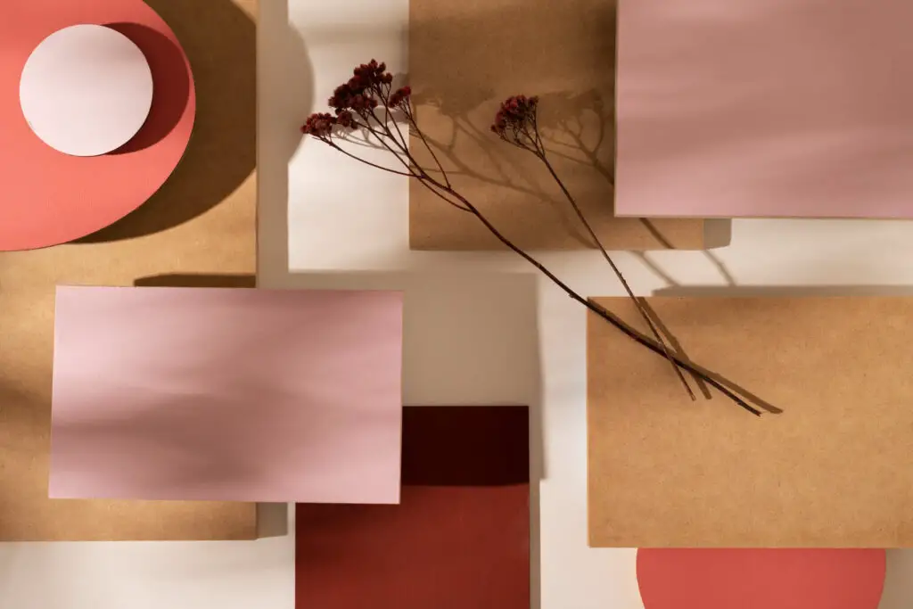
Bold pastels are stepping out of kids’ rooms and into grown-up spaces. Colors like lavender, peach, butter yellow, soft mint, and light teal are now being used in kitchens, bathrooms, and even home offices. These colors offer a subtle vibrancy as they’re cheerful but not loud. Pale lavender adds a calm, personal feel to a reading corner. Soft mint works well in kitchens, bringing light without looking too cold. Designers recommend pairing pastels with deeper colors or rich textures like velvet, leather, or brass to add balance and make the space feel more grown-up.
Finish Trends
Finish is playing a bigger role than ever. Matte is still the go-to choice for its soft, velvety look, but limewash and plaster-style finishes are gaining popularity. These add subtle texture and depth, making walls feel lived-in and less flat. Limewash has caught on for its organic, weathered look; it gives paint the softness of a watercolor but with more sophistication.
Color-blocking and full-room drenching are also gaining momentum. Homeowners are no longer stopping at one feature wall. Now, painting ceilings and trim the same color as the walls creates visual continuity. When done correctly, this makes even a small room feel cohesive and intentional.
Exterior Painting Trends
For exterior house painting, homeowners are choosing colors that feel bold but still blend with nature. These shades help homes stand out without looking out of place.
Natural Neutrals & Statement Tones
Colors like mushroom taupe, weathered green, and copper brown feel grounded and blend well with the outdoors. At the same time, more people are trying bold shades like navy, charcoal, and forest green. These colors don’t shout for attention; they feel strong and calm at the same time. Homeowners are starting to prioritize depth and dimension in exterior color choices, with dark, moody shades trending even in warmer regions.
Accent Trim and Doors
More homeowners are turning trim and front doors into statement features. Instead of the default white trim, people are painting them in black, dark green, or even contrasting earth tones. This adds definition and draws attention to architectural features. A dusty blue house with charcoal trim and a warm mustard door? That’s the kind of curated look homeowners are after. These small touches offer high-impact results with minimal cost and commitment, making them especially useful for homeowners unsure about committing to a bold color.
Durability and Curb Appeal
A fresh coat of paint can boost curb appeal, but it won’t mean much if the color fades fast. That’s why more homeowners are choosing paint that can handle sun, rain, and wear over time. Long-lasting color depends on more than just the paint itself; it also comes down to how well the surface is prepped and what finish is used. That’s where a good painting company makes a difference. They know what works, what holds up, and how to apply it right so the color keeps looking sharp for years. In places with changing weather, weatherproof paint is a good pick. It lasts longer and keeps the outside of your home looking nice with less effort.
Tips for Choosing the Right Trend
These tips will help homeowners select paint that suits their space, lifestyle, and personality.
Lighting, Layout, and Architecture
Color is light-dependent. A warm beige that works in a sunlit room may look grey and cold in a dim hallway. Always test swatches at different times of the day and in various parts of the room. For older or character-rich homes, subtle earthy tones enhance existing charm. For newer builds with open layouts, bold pastels can define zones and add movement.
Adapt Trends to Your Setting and Lifestyle
You don’t have to follow interior design trends the way they’re shown in magazines. That deep green you love might feel too heavy on all four walls, but it could look great on shelves or a kitchen island. The point is to make your home feel good to you. Choose what feels right and make it yours.
Leverage Color Psychology
The colors you choose can really change how a room feels. Blues and greens can create a sense of calm, bring a peaceful vibe. Yellow adds energy and can make a space feel more open and friendly. Red feels bold as it can stir up conversation and is even said to increase appetite, which is why you’ll often see it in dining areas. When you understand how different colors affect mood, it becomes easier to choose the right one for each room in your home.
Benefits of Hiring a Professional Painting Company
Hiring professionals isn’t just about getting help with the work; it’s about knowing the job will be done right. Professionals are aware of how colors appear on different surfaces and how to prep the area before painting. They are also aware of which finishes last the longest. They can help you avoid common mistakes like patchy color, rough texture, or paint that fades too soon. If you’re unsure about the color, many companies even offer digital previews so you can see the result before they start.
Final Thoughts
Color changes the way a space feels. Some lean into warm, earthy tones that feel safe and lived-in. Others go for pastels that add light and personality. The goal isn’t to follow trends. Confidence comes from choosing something that feels like them. A good painting company understands that. With the right help, even unsure homeowners can pick a color they’ll love for years. Even if you’re unsure, with a little guidance, you can land on a shade that feels honest. Not perfect. Just right. Something you’ll want to live in, not just look at.